When my younger brother got married earlier this year, I asked him to send me his wedding vows so I can create them as a calligraphy project. He emailed me two vows, one spoken by the bride and the other spoken by the groom. I put them aside, not knowing how I wanted to execute the design yet.
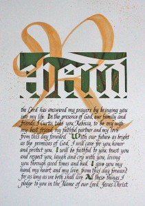
Then in Barbara Close’s Uncial/Gothic workshop, she gave a homework assignment that I thought would be perfect for the vows. The assignment was to cut out around the letters on a page, with some text written underneath. In my case, I used the first word of the vow, Rebecca, and the vows under the name. Here was my assignment:
This was created on 11 x 14″ Strathmore 90lb. Mixed Media paper. I first spattered the page with Finetec metallic watercolor with a toothbrush. The gold R was painted with the same paint. Guidelines were put on a separate page and I used a lightpad to see through. The vows were lettered with a Lamy fountain pen. The first letter indicating each vow’s paragraph breaks were lettered with green ink then lined with a Sakura’s Gelly Roll gold metallic pen.
I cut a sheet of heavy paper from Stampin’ UP! to size (green to match the capital letters below), splattered more of the gold paint on it, then wrapped it with Stampin’ UP! multicolored ribbon, and place it behind the cutouts.
I wasn’t sure how the R separated from the rest of the cutout letters would fare, but I went with it because I wanted the lettering cutouts to be as large as possible, and adding the R to the left as a cutout would diminish the overall size. However, most people were stunned by the overall effect.
The groom was pleased with the result, so I’ll be doing the bride’s vows to him next. Instead of green accents, though, I’ll use wine-red accents. This is an excellent idea of how we calligraphers can use our skill to create gifts for others.
I wasn’t thrilled with the variable letter-spacing and letter-widths; they could be more consistent. I’ll need to practice that more.


