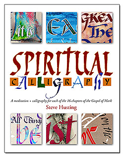
In the past, I let my spiritual side lead me and waited for inspiration to strike before I started on a calligraphy project. But that way was hit-and-miss, and led to long stretches of time between projects. Now that I’m putting my design training to use, I’m finding that the ideas come more quickly. In this post, I’m going to show you a process I’ve used recently.
Graphic art design is guided by principles, such as those using emphasis, harmony/unity, color/mood, typography, shapes/patterns/figures, and other principles. Here, I’m going to take a Bible verse, John 3:16, and apply these principles. First, the verse content: “For God so loved the world that He gave His only begotten Son, that whoever believes in him should not perish but have everlasting life.” How would I illustrate that with calligraphy?
At this point we are only gathering impressions, not looking for final ideas, so we should not self-judge here. Ideas put on paper now may spark more and better ideas as we go along, so put down every idea, no matter how crazy, or whether you’re able to actually execute it.
Figures/Shapes/Symbols
Looking a each word in turn, what figures and shapes come to mind? They could be literal or figurative, shapes that show or suggest the idea.
- World: earth, world map, globe, flags of nations around or between letters
- Gave: cross (gave up Jesus to die on the cross for our sins)
- Loved: heart, kissing
- Loved world: earth shaped like a heart
- Son: shape of man
- Father/Son: silhouettes of man, son
- O of world like a globe (with “the” on the inside)
- O of God a heart (with “so loved” inside)
Emphasis
What concepts or words should be emphasized? What should stand out as prominent and what should be pushed into the background?
- Emphasize words: God, loved, world, son, gave, eternal life
- Emphasize figures: cross, world.
- Lesser: “that whoever believes…but have” in smaller size could be in an arc to suggest world.
Color/Mood
What colors should be used? What mood does the passage convey? Colors themselves often convey mood, but so do other elements.
- World: blue, green, brown
- God: light, yellow
- Cross (a symbol of Christ’s expression of sacrificial love): red (blood spilled)
- World: dark, black (symbolizing that a world without God is a place of darkness)
- Eternal life: light, yellow
Background
- Based on what you’ve got so far, can you think of what the background should be? Can you assemble the different figures, emphasized words, and colors and come up with a background that creates a setting that holds the whole thing together?
- Rough, red cross of quick brush strokes on a dark or solid black background. Words will overlay both. If red were dark, then all lettering will be more easily readable when light against dark red and dark background.
Harmony/Unity
Make sure all the elements are working together to uphold a common theme. If the mood is strongly upbeat, for instance, then make sure the shapes and emphasis convey the mood and don’t detract from it. A few ways to achieve unity is by using the same few colors throughout, especially if they work well together and support the theme of the project; using similar-toned colors such as pastels/tints; using only a few fonts; placement of the elements; and others.
- Color of text will be white and yellow for strong harmony.
- Text will be Roman caps and Italic.
- Top and bottom, font and color: God, everlasting life: same font of Roman caps, white against black. Son will also be in all caps; perhaps same size as everlasting life. White.
- Middle, font and color: Italic, in sentence caps, perhaps yellow so the white letters stand out.
- Placement: lettering will largely follow the shape of the cross under it for harmony by proximity. Lettering does not have to stay within the cross. Design therefore will be vertical orientation if all sentences pile on one after the other. However, it could be horizontal or square orientation if the words “that whoever believes … everlasting life” are allowed to drift off to the right in three long lines, placing the cross at the left, or center.
To learn more about design principles, check out these sites:
http://www.graphics.com/modules.php?name=Sections&op=viewarticle&artid=853
http://www.killersites.com/magazine/2010/fundamentals-of-graphic-design-part-1-alignment/
http://desktoppub.about.com/cs/basic/g/principles.htm
http://en.wikipedia.org/wiki/Design_elements_and_principles

