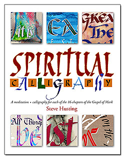
This calligraphy conference was held February 2014. I was a student in Carl Rohrs’s class (my work in two of the styles, folded pen and pointed brush pen, are shown in the photos). Below is a report on my class experience.
Here are some of the photos I took: http://www.flickr.com/photos/95697769@N07/sets/72157641146779095/
A class walk-through was held on the third morning of this 4-day conference, and I shot several photos of unfinished student work in each room. It was nice to see Massimo Polello and Jake Weidmann as teachers this year.
Massimo and Lisa Englebrecht did a live collaboration, taking turns at a large (maybe 3′ square) board while we all watched. (The result was auctioned off at the conference for about $80.)
Course title, What Matters Most, with Carl Rohrs
Feb. 14-17, 2014
Carl presented us with a spiral-bound, letterforms textbook. He had cut our names out with a vinyl cutter and affixed them to the inside front cover! Beautiful and striking calligraphy styles floated across every page. It whetted my appetite for the class. At the end of the class, I discovered a hope that I could, with practice, execute almost any of the styles in the book with the tools we used in that class that weekend.
On the first day of this four-day workshop, we learned to use a 1/4″ Horizon folded pen (similar to an automatic pen tool) to form characters similar to Italics. He then told us “What Matters Most” about pen lifts to form various shapes when terminating letters, showing us the difference between lifting the outside and inside edges of the broad nib.
Carl then covered the pointed brush pen, and it was quite challenging to learn. Nevertheless, his insightful narrative and one-on-one sessions helped us through the difficult spots.
We focused more on letterforms than on any finished projects in class, so I went in before classes to create a few designs (here and here). I was happy with the results of my new-found skills, and people were able to see our class work in a design context during the walk-throughs.
His slide show narrative introduced us to several great lettering artists and the inspiring graphical results of their phenomenal dedication to the craft.
Later on, Carl surprised us all by giving each of us a poster of his calligraphic work, Alphabet Dandelion, with various alphabet styles in black and red arranged in three concentric circles.
On the last day, we gave the brush the brush-off and let the ruling pen rule. We gained a wonderful appreciation for this tool as well. This was my first Letters conference and I’m looking forward to the next one!

