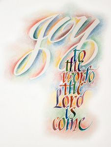
I finished my second version of Joy to the World. The problem with the first version is that although the word joy was there, the “joy” wasn’t. So this version was an attempt to put the joy into the work. It accomplishes that better than the first attempt.
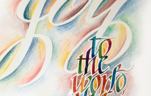
I used brush and folded pen to do the preliminaries sketches for the “Joy.” You’ll see them all in the video I made of the process. As you’ll see in the video, I painted the letters below “joy” by tracing the letters with a light pad. Then Joy itself was outlined with colored pencils, warm tones on the left edges of the letters and cool tones on the right. The paper color was allowed to show through the letters themselves. The video doesn’t show it, but after all the painting was thoroughly dry, I heavily retouched the letters with colored pencil to form the letters nicely where the painting was uneven. I used gold gouache to fill in some of the counters.
At the time of this writing, the artwork is hanging in the Showcase Gallery in Costa Mesa, CA (across from South Coast Plaza, north along Bear St.) throughout the month of March 2015, along with around 20 other calligraphy pieces by talented fellow students. If you live in the area and you’ve never seen actual calligraphy artwork up close, now is a great chance to do so. My photography never does my work justice.
Below is the artwork. Below that is the video. Enjoy!
In summary:
“Arches w/c” paper, 90lb
Berol Verithin colored pencils
Prang watercolors
Winsor & Newton Gold gouache
Horizon Folded Pen (in preliminaries)
Various size brushes
Moon Palace Sumi Ink (for preliminaries)


