In our class in Uncial lettering, we wre to create a book of 5-6 pages, including a colophon (https://en.wikipedia.org/wiki/Colophon_(publishing)).
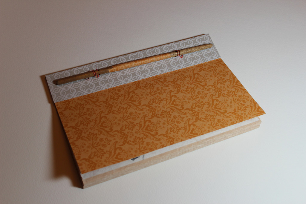
Its size was to be half a page with wide orientation. The paper was to be folded in half with the ends at top. The top ends will be gathered and punctured for the binding. The turnable pages will show folded edges.
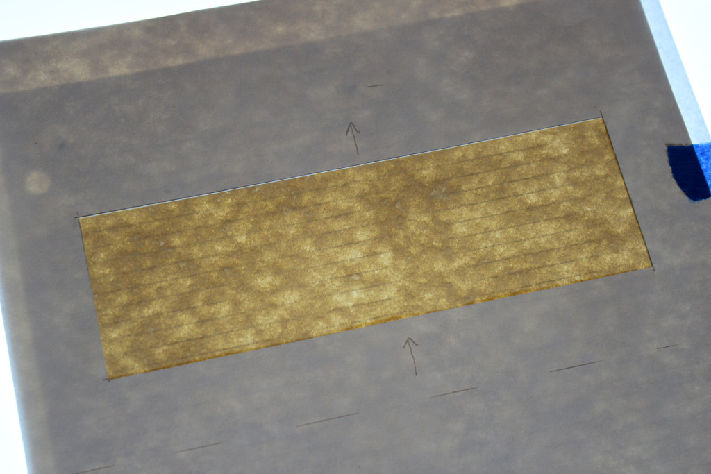
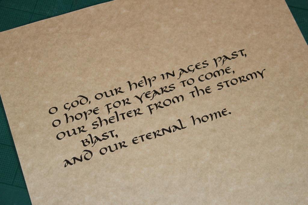
I settled on a hymn containing lines of text that were short: “O God our help in ages past.” I created a paper mask, cutting a hole in the page where the text will go. All text needed to fit in that space to keep the margins consistent. It gave room for 1-2 lines to wrap. Arrows on the mask told me which way was facing up.
I found a box of faux parchment calligraphy paper I had not used in years (forgot I even had it). It wasn’t my first choice of paper in this case, but the two other choices I wanted to use had exactly 6 pages each, and that didn’t leave me with any margin for do-overs. As it was, this project caused me to re-do 5 pages! That’s way more than usual, especially for a small project like this.
I also created a page with guidelines. So I placed the lined paper on a light box first, then the parchment paper, then the mask, taping them together with blue painter’s tape.
I used this method to write the pages.
I wanted to do something more and hit on the idea of adding embossed words to each page, inspired by a classmate, Juan, who had wowed us with several of his embossed pieces.
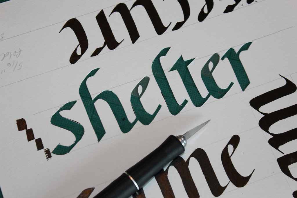
I chose to create a word on each page that was taken from that page. I inked out each word on thick watercolor paper in upright Italic, thickened the thin areas with a marker, then cut out the letters with a hobby knife. I made sure the longest word would fit in the space for it. In the photo, you can see the green cutting board through the cut letters, and the inked uncut letters. Below, you can see the thin serifs in black, and the thickened lines in the cutout (green cutting board showing through the letters).
I ran clear tape over the letters to hold in the counter pieces, like within the a and e. I eventually added tape to the front and back in those areas when the word mask either stuck to the light table (inconvenient) or stuck to the paper after burnishing (disaster in the making).
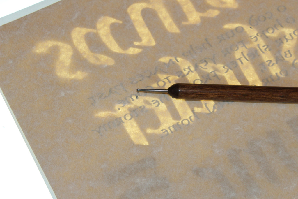
I put the paper mask on the light box so the words were backwards, and the parchment paper on top, face down, so I’ll be rubbing on the blank side of the page, not the inked side. This setting pushed the letters up off the page. (Juan said that burnishing the lettering side did not smear or harm the dried lettering when he did it that way.)
I used a craft ball burnisher tool (stylus tool) shown in photo above to trace the edges of the word mask, briskly but gently rubbing it back and forth inside each letter edge. This pushes the paper into the cutout letters, raising them.
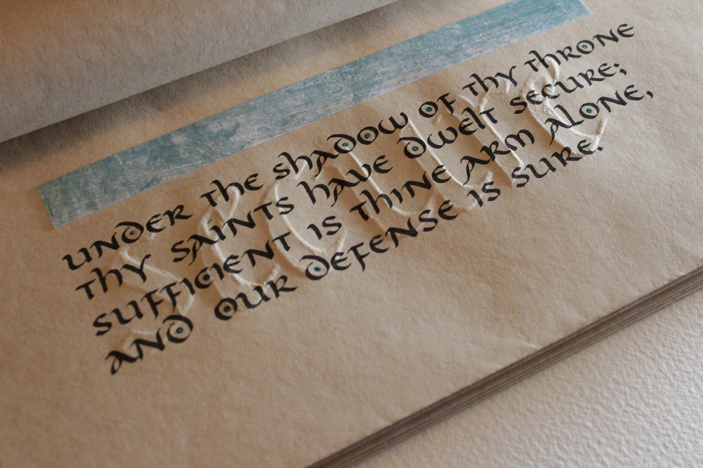
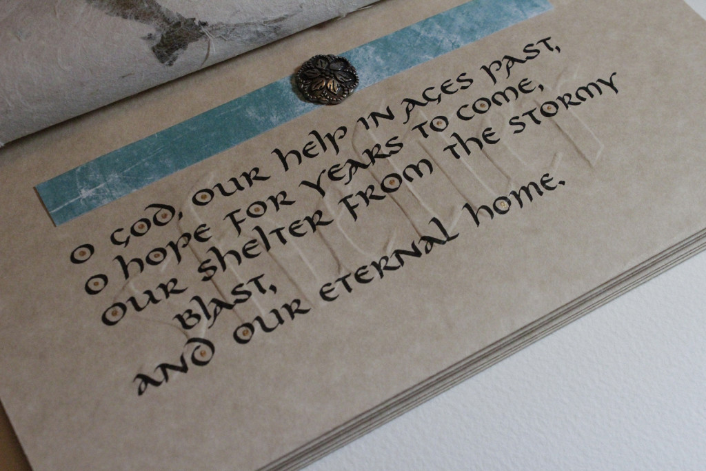
The burnished lettering added a 3D texture to the page that complemented the printed texture, and will reward the careful reader when she slants the page against the light source.
My hand was tired after cutting only one word. To rest my blade-holding hand between each word, I would cut out a word, burnish the previous dried page, then link out the next page, then rest my hands a while. This sequence took one hour each page, not counting the time resting between each sequence.
For the first page only, I added a metal embellishment from my wife’s Stampin’ UP! collection of paper craft embellishments. I punched a hole in the top side of the paper with my craft knife (remember that the page is folded in half; I did not punch it all the way through), inserted the tines, then spread them left and right between the pages to hold the embellishment in place. This would have been easier if I had done it before binding. Don’t let ease get in the way of creativity! This was worth the extra trouble.

