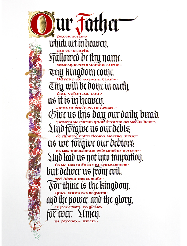
This project began as a homework assignment in Barbara Close’s workshop at her studio space in Costa Mesa, California. We were to do a piece with Fraktur or Gothic lettering paired with gold gilding. I settled on this text because I wanted a Bible passage in my repertoire that was more familiar to people than many of the obscure texts I have used earlier, as posted in my Etsy store. To make the work more interesting, I decided to add red Latin text between the black Fraktur text, of a style having the same even x-height throughout, and that decision led me to use Half Uncial. I chose that over Uncial to challenge myself to try something I haven’t done before, and because its unusual letters looked interesting, and because I thought it was a better fit with the Latin text.
My first attempt was a disaster. I chose to do long, flowing gold and black tendrils down from the O as a column of decoration, with the weaving tendrils swerving right to become background texture for the black Fraktur. Unfortunately, instead of “flowing,” they were uneven and poorly executed. This wasn’t surprising, because it was out of the mainstream of what I usually do. I should have applied myself to pages of practice until I got it right, just as I did for my offhand flourished bird here, and my Happily Ever After here.
Next mistake: I started the Our Father prayer on the vertical guidelines meant for the offset Latin text. Third, the spaced horizontal guidelines were not consistent down the length of the page, which would result in uneven line-spacing. Lastly, when I lettered the third line of the prayer, I made the x-height one step too large at one point, then normal size further down the same line. I stopped right there. Time for a do-over. I missed the deadline for the class, but I did not give up. I was surprised to see this many problems in a single project. However, it was a complex undertaking.
This time I measured the guidelines more carefully. (I used the Ames Lettering Guide for this purpose.) I marked which vertical guidelines were for the Latin by adding a small X where they begin. They are offset to the right about a half inch (25mm). See the topmost image.
For the new version, I kept my custom design for the gilded O as before, fashioning it from several sizes of circles with a Pickett Circle Template and my drafting skills. You can see below that I applied the Instacoll adhesive fluid first. After giving it several hours to dry, I “huffed” several hot breaths onto the Instacoll and quickly applied a 23K Wehrung & Billmeier Co. patent gold leaf sheet, pressed it down all around, then lifted up the sheet. I brushed away the excess gold with a soft makeup brush. I did the counter of the O first, then the outside of the O in a second round. I painted the O itself with Winsor and Newton’s Cadmium Red gouache paint. For design unity I used the same red for the F in Father and all the Latin text. My paper was 22.5″ high by 14″. Margins top and bottom in the finished piece were about 3″.
I tried out a few different left column border ideas in pencil, then settled on something more colorful that Barbara had demo’d in class before with sponges. I drew the lines, then laid down blue painter’s tape on either side to mask it off. I already had a set of artistic sponges and used those. I used Winsor & Newton gouache with Light Purple, Permanent Green Middle, and Cadmium Red for the border. While it was wet, I sprinkled a little bit of Schminke gold flakes. When it dried, I peeled away the blue tape and applied a few freehand stokes with Winsor and Newton Gold gouache, undiluted, right from the tube with a 1/8″ dry brush. When it was done, the design reminded me of an abstract stained glass window.
You can see my work layout here. I used a slant board with a vertically sliding edge. I used a clamp-on portable light that was powered by USB hooked up to an external USB power source (great for taking along to outside workshops). A printout of the prayer in English and Latin in their respective lines and colors was always at hand. I used a L-shaped hand rest made of blotter paper. I placed several sheets of paper under the main sheet for slight padding. My paints were in a dish off to the left (not shown here).
I did only a little practice with the Fraktur. I had taken a Letters California Style 2017 workshop with Yukimi Annand and used her 2017 exemplar for the letters. When Barbara taught Gothic and Fraktur, I continued to use Yukimi’s version for more practice. So I was ready to use it when I lettered this piece. I did the smaller black lettering under “Our Father” all in one session with a Speedball C-3 and Moon Palace Sumi Ink. I made one mistake, and that was not making the letterspacing tighter for the longest line, which extended 1/4″ past its border. In the future, I need to make a note right on the page what needs to be done differently for a line.
After that it was time to study and practice the Half Uncial. I chose the exemplar from Patricia Lovette’s book, Calligraphy and Illumination, pages 58-59. It is taken from a page in the Lindisfarne Gospels, a page of which was reproduced in the book. (The link does not show that page, but a different one.) All of my practice was at the scale I was going to execute the work, 1/8″. At first I used a 1mm Brause. It was a clean, open look, like Uncial, but did not really match the dense quality of the Half Uncial original, so I went to 1.5mm to thicken it. I had trouble getting the gouache density correct, so I switched to using ink to do the lettering practice. After I made the letter stoke order on my own, I checked Patricia’s exemplar more carefully and changed the order of my strokes, having more familiarity with the letterform nuances. Her stroke order just made more sense for the nuances I came across. Paying more attention to the Lindisfarne page sample, I noticed that the letters were more compact and tightly kerned than the rounded and expansive way I was practicing, so I changed my practice accordingly. It could have been even more compact, but I’m happy with the way it looks.
I eventually switched to a more familiar Speedball C-4 nib for the lettering. It matched the density of the Lindisfarne text better and the gouache went down better. I went ahead and lettered all the Latin text in one go. I made two mistakes where I started putting down the wrong letter, then made up for it by doing the rest of the letter correctly. A third mistake was putting in the wholly wrong letter (it’s in Latin, so who would notice?) — an o in place of an e. I expect to fix these three areas in the digital version, copying/pasting good versions of the letters in place.
I see that medieval texts did not use punctuation like we do today, so in place of commas, I inserted a square, and for a period two squares. Neither form was in the Lindisfarne Gospels page, though.
I chose not to do any further additions to the page after adding all the Latin. With this paper (this was a half sheet left over from another project and the identifying label was missing), any ink or gouache applied was there for keeps; a hobby knife only smeared the media instead of scratching it off. So every stroke of the pen and brush was a full commitment. Unlike my earlier days, I challenge myself not to use Photoshop for a finished piece, but just to retouch the prints.


One Response to The “Our Father” prayer artwork process