This project began as a homework assignment in which we were to put text in a circle using Copperplate. I drew a couple of circles for the baseline and x-height that would fit neatly on 11 x 14″. I drew them on translucent grid paper of that size. I figured I would make the final piece on 11 x 14″ Bristol board, cut to 11″ square. The x-height circle was 5 1/2″ in diameter.
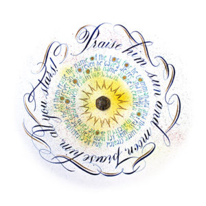
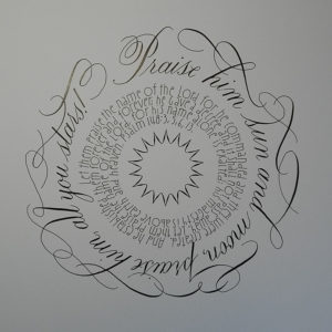
I wanted the circle motif to make design sense for the words. I chose a psalm from the Bible that included the sun, moon, and stars, all circular things. My first chosen verse was too long to fit on the circle, so I chose another verse that did, from Psalm 148. I drew the outer swashes in pencil, erasing and redrawing until I was pleased with their composition. In some cases, the letters linked; in other cases, I drew free-standing swashes that linked letter swashes on either side.
Then I was confronted with the center of the circle. What to put there? I drew a variety of swashes for the space, then rejected them all for a spiral treatment of more verses from the same psalm. (I’m playing to my strengths here. I’m not so great with swashes — they are still a bit squiggly.) I decided to use a modified Romans lettering style I remembered seeing in a calligraphy class handout. It had a relaxed, friendly style that I thought complimented the Copperplate. I hunted through my 3-ring binders of handouts until I found the example by Hans Joachim Burgert. Here is an example of this style I found online so you can see his version: https://s-media-cache-ak0.pinimg.com/236x/f2/94/a2/f294a2b16bcf1066701db69ac45e6801.jpg
I had already drawn some spiral guidelines in Adobe Illustrator for earlier projects. You’ll find them here: https://stevehusting.com/calligraphy/2013/07/21/spiral-and-circular-spacing-guides/ In this case, I used the spiral guide that allowed only one space, so the lettering will be tight. In the download, I have another guide that will spiral in a way that leaves space around the letters.
I slipped the spiral guide under the translucent paper and copied over several verses from Psalm 148 to see how they looked and fit. I stopped at a convenient space where the lettering wouldn’t get too weird in a small circle. Then that left another design decision: what to put in the center? I tried a variety of swashes, then ring designs, and ended up adding the “sun” in the text.
With that out of the way, I grabbed the Bristol board, translucent paper draft, and light pad, and copied the whole thing over to the smooth Bristol board. I drew the first draft in black with a Zebra G nib with Moon Palace Sumi Ink, black. I saw how shaky my swashes were, so a lot of practice was in order. A filled a page or two of swashes on Bristol board (the final material), and learned a few lessons. For some reason, the nib would skip or slide in a straight line. After a few experiments, discovered a few things. I needed to merely turn my pen to a flatter angle for the nib; when I saw the improvement, I guess the nibs were not even on the surface to begin with.
Next, I notice the uneven transition from the thin line to the thick line. When I do swashes, I turn the page so the thick lines will be oriented vertically, so I pull down and press down to form them. The thin lines are formed when I go lightly up the surface. The trouble came when I went up with the thin line, then around, then started pressing down too soon for the thick line. I needed to go up, make the loop, then press after the line was out of the loop and headed down. So that helped me make smoother swashes.
In addition, I needed to get my arm off the table more for freer, looser lines, and I needed to let the nib barely touch the surface going up so it did not get stuck.
Officially, the project was done. The circle was there — with the addition of a spiral! But I challenged myself to get out of my comfort zone and do it in color. That added a whole new slew of design decisions to make.
My first attempts were of circular washes of pale color using a 1 1/2″ rough brush. I switched to a blue ink I hardly ever use for the lettering. I attempted this several times; but I smeared the ink at one point, and I felt the Zebra G wasn’t giving me the thin lines I wanted on the wash. So I abandoned the wash and the G. I chose the Leonardt Principal nib, which has always given me fine lines. It has a very different feel than the Zebra G; it requires a lighter touch and more control.
I thought I would use the marker-sprayed-with-compressed-air technique, but I did not have the colors on hand that I wanted to use. Letraset Air Marker airbrush wanna-be: https://www.amazon.co.uk/d/Airbrush-Materials/Letraset-LAM1-Air-Marker-Airbrush-Attachment/B000UBYFTQ
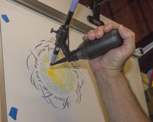
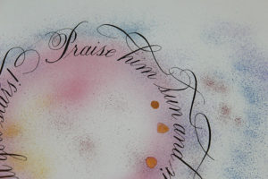
My wife asked what I was trying to do. When I told her, she showed me the Spritzer tool, which does the same thing, but spatters the marker with a bulb. She had a wide variety of marker colors, so that was a plus. See the Spritzer: https://www.amazon.co.uk/Dylusions-360109-Distress-Marker-Spritzer/dp/B00IRHZOPY/ref=sr_1_3?s=officeproduct&ie=UTF8&qid=1500663315&sr=1-3&keywords=Spritzer I inserted a brush marker in the holder, held it over an earlier rendering of the artwork, and squeezed repeatedly.
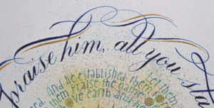
I tested whether the splatter would be too opaque and obscure the letters; it did not. I added Finetec gold watercolor and Winsor & Newton gold gouache over the splatter to see if it covered it up; it did. I saw how small and wide a distance I could cover, and tested forceful and lighter squeeze effects. I decided I would use this tool. From a design standpoint, the spatter could represent the “stars” in the text.
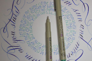
The project proceeded smoothly on Bristol board, though I was surprised that the blue ink took over an hour to dry. When it did dry, it dried with a shiny sheen. Nice touch! I used Sakura Micron markers, blue and green, for the center verses, with more blue text toward the outside and green toward the inside.
After that, I added gold touches throughout. I had deliberately made the Os of the center text large and round so I could add gold inside. I really like Schin Loong’s application of gold highlights to her Spencerian envelope addressing swashes, so I borrowed that design idea. See her work at http://openinkstand.com/ (see Services > Envelope Addressing).
I added the gold touches to the swashes, filled in the Os of the center text with a small Speedball B nib, and created the sun with a pointed pen. I used Winsor & Newton’s Gold gouache for all of it.
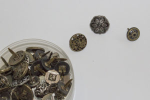
Finally, looking it over, I thought there was something missing in the center. I remembered the Stampin’UP! brads my wife had and looked them over. I chose one, made a tiny slit in the center of the page with my hobby knife, inserted the brad, bent the ends on the back side, then covered it with tape. It provided a nice accent for the piece.
I’m not sure the colors go well together because the tones in the middle text and outside text don’t match, but it still makes for a lively piece.

