I attended an Orange County Society for Calligraphy monthly meeting when Sharon Allende gave a workshop on making Celtic knots.
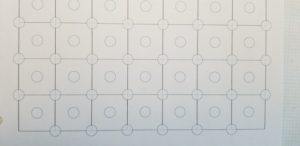
She showed us how to make Celtic knots with a template consisting of a pattern of circles and squares. To make the knots, you draw parallel lines from circle to circle. After a very informative workshop, which included several variations on a theme, I wondered how I could incorporate it into a piece. After a few months had passed, I got my inspiration.
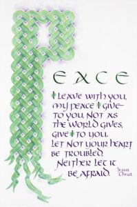
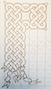
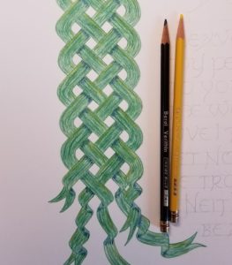
I chose to make an initial letter P from the Celtic knot pattern (rather than a border). After a while, I thought I would let the bottom of the P “unknot” itself.
I first created my own templates in Adobe Illustrator. In Illustrator, it’s easy to replicate a repeating pattern, like an evenly spaced row of circles, across a page consistently. When done, you can duplicate the page and enlarge or reduce it to create a series of separate templates.
Following Sharon’s handouts, I drew lines with the circle guide to create the form of the P. In the end, I used the circle pattern close to the size we were given in the class, with .3″ circles and 1″ squares.
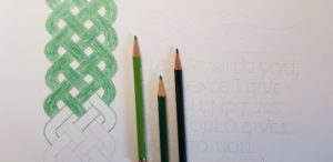
I traced it onto paper and painted the design to see how it looked. I wasn’t skilled in layering paint colors for shading (like you see with some beautiful examples of shading on the Acanthus leaves), so I decided to go with the Berol Verithin colored pencils that have been in my possession for decades.
I traced the pattern onto another sheet I got from Art Supply Warehouse, Lenox 100, 250g white, a paper I’m not familiar with, just to try something different. In retrospect, I wish I had put the letter design further away from the edges of the paper. The paper itself did not give me any problems with this project. It was thick and toothy. You could scrape it a little if needed, to remove any accidents. (Which I had to do twice.)
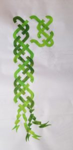
I began to work the green into the paper, trying to be consistent throughout the page. I used more than one shade of green to add richness.
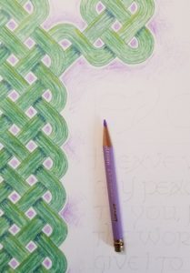
I layered purple colors for shading. I chose indigo blue shadows instead of black to make it more interesting. Again, I tried to be consistent throughout the whole piece. I carefully erased the pencil tracings that remained.
To add more interest, I gave the P a “glow” of sorts, using a web-like pattern radiating out of the nooks.
Next, I did the lettering. A few letter sizes, line breaks, and line widths were tried over separate sheets, the design constrained by the width of the sheet and the length of the quote itself.
When I was satisfied, I drew careful guidelines, then copied the lettering over lightly in pencil, proofing the text repeatedly.
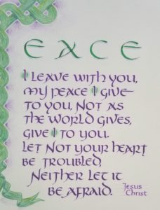
When I was ready to letter the quote from John 14:27, I warmed up in gouache on tracing paper first, lettering over the penciled marks until I could confidently create the Uncial letters smoothly. (I had lots of prior practice with this alphabet from taking classes by the wonderful and very talented Barbara Close.
I wondered whether to leave the bible reference off like I’ve done many other times. But then I thought the saying would have more impact if I included the identity of the one who was making this promise.
I waited 24 hours for it to thoroughly dry before erasing all the guidelines. I also tried several ways to add decoration to the initial I’s to add more color and add emphasis where it belonged — this is a promise from Jesus, the Son of God, to His followers. I also added a thin shade to the “EACE” above. (I did these steps after erasing the guidelines so I wouldn’t have to work carefully around these touches with colored pencils.) I cut the page to size, 14 x 18″, then took it to Michael’s to have it framed (just in time to take advantage of their 70% off sale that ended the next day).
The final product will hang in the Muzeo Museum and Cultural Center in Anaheim from December 2019 and the first few months of 2020 with other artwork from the calligraphy guild members. Do come if you can make it.
You can download the final size Celtic knots template that I created:
http://stevehusting.com/calligraphy/images/celtic-knot-grid-1x.3.pdf
David Nicholls has a YouTube list of videos devoted to the subject of Celtic knots:
https://www.youtube.com/watch?v=xce8NSx3AKo&list=PL_89CNt4D5TJ6Vde4kmJTR-Q2DtJ9z0q2
My artwork is now available from my Etsy store https://www.etsy.com/shop/stevehusting

