For this class assignment, we were asked to create a work combining Gothic and swashes, an example being a large initial cap with swashes. However, I challenged myself to think of a reason for them to appear together. In what way can I use these elements to communicate something in the words?
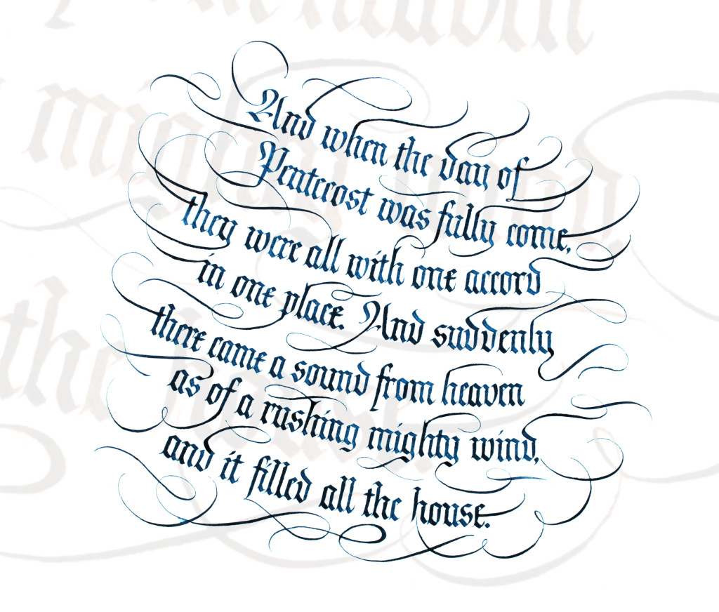
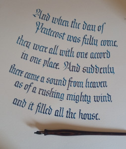
I chose to do Acts 2:1-2 and try to communicate the “rushing mighty wind” in the passage. I would do this in two ways: round the letter guidelines and stagger them to create the body of a whirlwind, and add the swashes to simulate air currents or streamers blowing in the wind. With this in mind, I got to work. First, here is how it turned out:
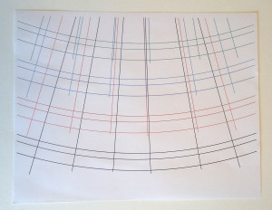
First I opened Adobe Illustrator and created the guidelines. I did this by creating a super-large circle (larger than the page) and marking its center point, then creating two more circles with the same centerlines. Those would be my X-height and ascender guidelines. I then drew straight lines from the centerlines through the arcs so I had “vertical” guidelines for the Gothic text that changed angle with the rounded guidelines. Then I grouped them together as a unit and greatly enlarged them to fill the page with a portion of the circle, and made several copies of the group in different colors. In the end, I was only to use the bottom curve. The others looked too busy to be useful.
I put the guidelines under 11 x 14″ translucent marker paper and wrote the words, sliding the guidelines down and tilting the sheet so the text lines were slightly off. I wrote the words with normal Gothic text without thought as to how to add swashes.
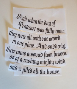
When that was done, I cut up the paper and taped them together to make the left line ends more ragged. When I wrote the letters earlier, I had lined them up, more or less, at the left edge of the page in order to make sure the text would fit across the page per line. So they were cut apart and made more uneven.
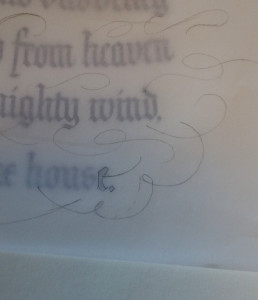
I overlaid another marker paper sheet on top and sketched the swashes in pencil, drawing and erasing until I was satisfied. So that became my sketch.
I measured the piece and decided I needed the final artwork to be 15″ square to accommodate 2″ borders all around. I should be able to find a 15″ frame, should I decide to hang the original on the wall.
I cut white Arches Text Wove paper to that size and pulled out my light pad for positioning. I put the marker paper sketch on first and put the Arches paper on top and centered the artwork. I deliberately tilted the artwork page so the text did not line up horizontally. I added a couple of Xs to the corners of the marker paper and the art paper to key them together, because I was not going to trace the sketch.
I slid the guideline sheet between the two pages to align the black guidelines with the first line of text on the sketch. I lined up the first vertical guideline with the first letter of the text so I knew where to start writing. I taped the guideline sheet to the art page. I removed the sketch and put it aside to keep in view. I was happy to see that I had developed enough confidence in my ability to use the sketch as a guide and not slavishly trace it. I focused very hard on keeping the word spacing the same, and keeping the space between letters and inside letters as consistent as possible.
The following photo shows the guideline sheet lined up with the text:
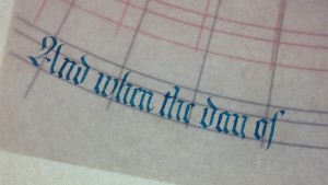
Each time I lettered a letter or word, I would first see if a swash was extending from any portion of the letter. If it was, then I knew to make sure that the area ended in a point for the swash to emerge from. For example, in the photo above, the “f” of “of” terminated in a point rather than a normal Gothic tail because I will pull a swashed line from it. Compare it with the sketch photo earlier.
To make sure any oils of my hand did not transfer to the page, I kept a thick sheet of paper underneath.
I did not do the swashes until after all the lettering was finished and dried overnight.
As I finished each line of text, I paired the sketch and art pages, lining up the Xs on both pages, inserted the guideline sheet for the next line, taped those together with blue removable painter’s tape, then removed the sketch.
Now it was time to do the swashes. I separated the penciled swash sheet from the lettered sketch, went over the swash lines with a thin marker to make them viewable, and put the swash sheet in back of the artwork on the light table. I taped those pages together. I then turned them 90 degrees counterclockwise so I could draw my swashes vertically, especially the thick strokes (you can’t draw thick lines while pushing the pointed pen upward). So I started at left and drew the swashes, one after the other, from left (top edge) of the paper to the right (bottom edge). I rotated the page to do the other edge. In this way I avoided smearing any of the work.
Actually, there is one spot where I drew a thin line through a thick line that still beaded up with a thick layer of ink, and “pulled” it along, greatly widening that thick letter at the intersection. I had tissue paper at hand in case something like this happened, and lightly touched the ink to soak it up as much as possible. Then I used a craft knife to gently scrape away the excess ink, but also scraping some of the paper with it. I really should have stopped at the thick line, lifted the pen, then continued on the other side. This is actually the process I followed for a few other swashes in this project.
I was pleased that I still had the ability to draw these swashes without the normal, nervous squiggles that characterized my earlier practice on the flourished bird I did a while ago. So all that practice paid off for this piece. I had tried around 10 or so swashes on a scrap piece of paper to make sure I could still do it comfortably. I consider all of my calligraphy pieces as practice, because they are all preparations for better work to come. Also, calling them practice lessens any performance nervousness — it’s just practice!
After shooting it with my camera and viewing it in Photoshop — my familiarity with Illustrator and Photoshop comes from my product photography at work — I decided to add a little something to the background. I copied a small portion of the artwork, pasted it in, and chose “Multiply” to drop out the white background and let the background and the copy both show. I greatly enlarged the copy and dropped the transparency to about ten percent of what it was, forming a background texture. You can see the light texture in the photo at top.
Once I was satisfied with the piece, I printed it out for my 3-ring portfolio binder, and set it up for my Etsy store.

