Our class assignment, given by Barbara Close, was to do a piece in Italic in two nib sizes and two colors. I had the idea of doing Psalm 103 after my pastor spoke on it the following Sunday. With Psalm 103, King David tells us of the benefits of knowing God dwelling in their midst. I thought I would list those benefits in a circle around “Bless the Lord O My Soul,” the words that begin the psalm. To add context for the blessings, I would include the explanatory “forget not all His benefits” running through the middle. So it’s a song about counting your blessings.
I sketched out the idea in actual size on large paper. I used a compass to make a large circle, then measured four lines 1/4″ apart for the center line of text for its x-height and ascender and descender guidelines.
I picked out as many of the benefits as I could find and counted them. My first thought was to put the words in a single ring around the main text as many artists have done in the past. To make things more interesting, I decided to make each benefit swirl out in individual mini-arcs.
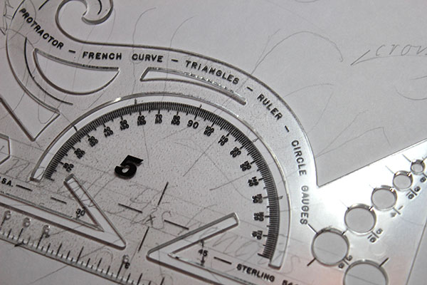
So instead of drawing a ring outside, I placed my protractor so it lined it up with the “forget” line, and marked off 30-degree marks all around. (30 degrees gives just the right amount of space to spread out the benefits equally around the circle.) Eventually I was to make 11 marks, ten for benefits and one for “Psalm 103.”
I drew a line from the main circle’s centerpoint through each protractor mark to intersect the circle. That’s where the benefits would radiate from.
I made the sketch in pencil, opting to keep the large text loose to give it some exuberance, as coming from the heart. I kept the letters outside the inner line of text so as not to obscure them. Then I wrote the benefits, thinking to summarize them with their key words instead of using phrases.
Next was to do a sample in ink to see how it looked, and create a model to trace from with my lightbox. I used Canson’s Marker Paper for the sketches because it’s easy to see the sketch’s guidelines through the paper, and it’s thin enough not to block the lightbox.
I disliked several things about the inked version. The single words seemed too skimpy to me, so I decided to use more words for each. I did not like the text covering the capital B, so I shifted them over to the next 30-degree mark. Lastly, It didn’t seem right to include a few characteristics of God Himself mixed in with the benefits, so I hunted up for more benefits in the psalm to take their place.
I created a third sketch for that purpose. I wanted all the arcs to be equal, so I devised a way to do that. I placed a scrap of paper over two of the marks that intersect the circle, then worked out where the compass needed to be placed to draw an arc from the tic mark, and marked the spot. I drew the arc guidelines. Then it was a simple matter to slide the paper from mark to mark around the circle under the page and make the arcs. Then I lettered the text.
You’ll see a couple of arcs at right without lettering. Those arcs were added after the lettering when I made the wrong arc angles for the words at those two locations. That’s because I had made several Xs on the arc tool when experimenting and used the wrong ones in those places. I then scribbled over those marks to keep the good ones clear. I made those arcs in anticipation of using them to do my lettering on the lightbox.
For the final piece, I chose to use lightly colored paper because I had it on hand and because I seldom use colored paper. It was 280gsm BFK Rives, gray, from France. (No — I had purchased it a few miles away in Westminster, CA.) I cut off a 4″ strip from a long side (for a future accordion book class project), then cut the rest in half. Unfortunately, it was too thick for me to use my trusty lightbox, so I copied the guidelines over by hand.
I did the large lettering first (5mm Brause nib with W&N Crimson ink) then the center lettering (Speedball C4 with Moon Palace Sumi Ink). The “the” between Bless and Lord was rendered with a 1mm Brause. I used the arc template to pencil in the outside arcs in the right places, and lettered their text with a Speedball C4.
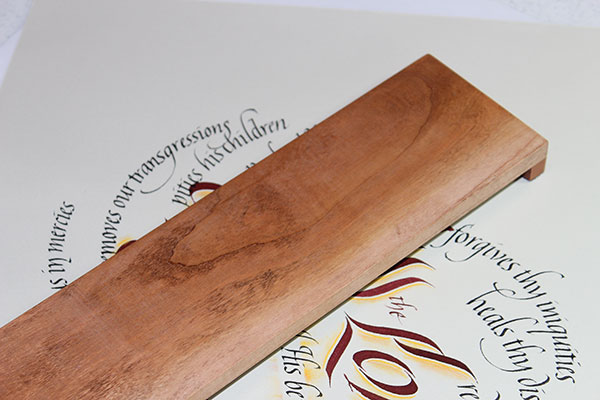
To keep from smearing any work as I got further around the circle, I used a bridge to elevate my hand above the text. In all other cases, I used a large, thick, L-shaped scrap of watercolor paper over the paper to keep hand oils from touching the surface. Not just to keep the surface clean, but so oils don’t unexpectedly affect the ink.
After the ink was applied, I thought it could use more dimension. I used an idea taught in a class by Holly Monroe and rubbed yellow pastel in place to the right of each large letter. Then I covered the center line of text and pushed pastel strokes outward. That’s a technique I picked up from a class with Barbara. I did this for above and below the center line of text.
That left the area to the right of the B rather bare. I decided to add florishes that I learned from a weekend class when Heather Victoria Held came and taught. (That was some years ago.)
I sketched them out first (of course — you know me!). Then I did a modified version of the sketch, using gouache of a similar yellow as the pastels with a Gillotte 404 pointed pen. I thought that using yellow only would keep it color-coordinated and keep the words emphasized. The jury is out on that decision.
A day or so later, the yellow pastel “shadow” areas seemed too plain, so I added a little more depth with red colored pencils. I also added a bit of red to the pastel strokes above and below the center text.
Overall, I’m satisfied with the work. I was happy to see that my letter flourishes and B flourishes were smoother than in the past. I see a few areas of concern, though. Two of the arcs of text are long and get too close to the next arc. Those arcs should have been aimed at a steeper angle. This is something I can fix digitally for my Etsy store.
I notice that I should have cleaned the nib more instead of doing a marathon race around. As a result, the words in the lower left are getting thicker. Then the final two arcs are regular size, and you can see the difference in thickness.
I wondered about adding marks to the centers of each of the large letters, but thought against it. I could always experiment with that in Photoshop if I were inclined to.
I did mention cutting a long piece to be used for a future accordion book homework. The future is past, and here is the finished book. Quote from Plato, “He who is of calm and happy nature will hardly feel the pressure of age.”


2 Responses to Artwork process: “Bless the Lord”