
Before you can rule the world, you have to rule the page!
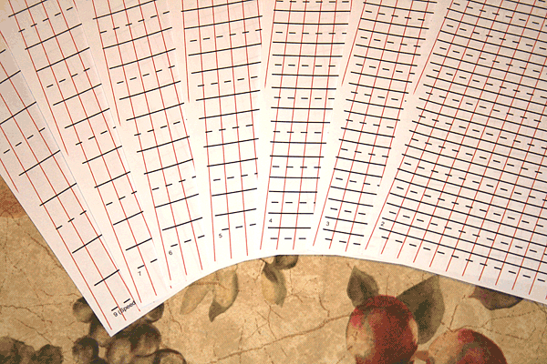
I created a PDF of guide lines. It includes the horizontal and slanted-line guides containing a variety of spacing sizes to accommodate 3mm pens up to the Speedball C0 nib used in the videos. See the Downloads link on the home page for more details and the download link. For those who need to put guide lines on the page by hand, here is one way to do it.
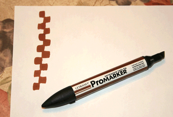
First prepare the paper by drawing guide lines based on the size of the nib you are using. Make five staggered strokes. This will denote the x-height of your letters (the height of the lower-case letters apart from their descenders and ascenders). Then add four more staggered strokes above and below for the ascender and descender strokes, as shown above.
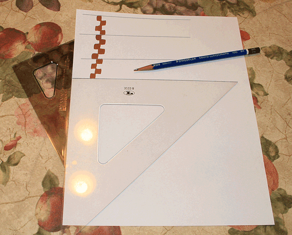
Get out a 30-60-90° or 45-45-90° triangle, line up one 90° edge with the side of the paper, and the horizontal edge with the marks as shown. Pencil in the guide lines as shown above.
When I started practicing calligraphy years ago, I would copy an alphabet from a book onto ordinary, three-hole lined paper every schoolchild is familiar with. I copied the letter "a" over and over, comparing it to the "a" in the book. I would be frustrated because my "a" looked so unlike the book's and I couldn't figure out why.
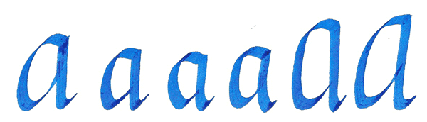
Looking back, I can see it's because I did not observe the appropriate height ratio of the letter. In this case, the "correct" height for italic cursive body-height is five times the pen's width. So always use those checkerboard (or staircase) marks when they are given for an alphabet. If they are not given, determine the ratio by stacking up the thickest stroke you can find in the letters to make your own guide. It will save you hours of grief when practicing!
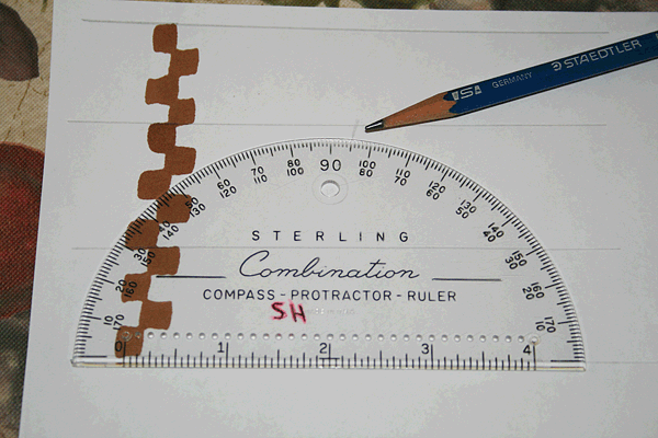
Italic cursive is lettered on a slant, so you'll want to draw slanted lines to keep them leaning at the same angle. Line up your triangles to draw a series of slightly slanted lines. A protractor (shown above) will be essential if you want your angles the same page after page.
For this app, I'm using a gentle slope of just 5 degrees from the vertical. Some prefer 7-10 degrees. Angle change, along with overall wider or narrower letters, is part of our toolkit, so experiment and see if your projects could use a little change of angle or width for extra pizzazz!
With your guide lines ready, see the next section for warming up.