Homework Assignment, monoline

Here is a homework project I recently completed. I’m attending a Barbara Close workshop held in Costa Mesa, CA, learning Roman Monoline. This project constraints included using two colors of gouache paint and two sizes of round pen nibs. (Gouache paint is like watercolor, but denser and more opaque.) We had several writing styles to choose from, and I chose this loose, letters-touching-each-other style because I’ve never done it before. I made it a personal challenge to make the text align left and right (rather than flush left ragged right). The number of words needed to be between 20-30, any source. I used Canson Mixed-Media paper, obtained from Art Supply Warehouse in Westminster, CA.

Psalm 23, Gouache on paper

Psalm 23, Gouache on paper

Continue reading

Posted in design | Leave a comment

Fantastic Calligraphy Links

I’ve been gathering calligraphy resource links on the web to add to my calligraphy apps. I’m putting them up here so anyone can enjoy the links. They are on two pages, one for videos, the other for non-videos. The pages are styled just as they are on the iPhone app – just make the screen narrower to make viewing more comfortable – or look up the page in your smartphone!

Check out the links here!  (Or type into smartphone browser: http://wp.me/p22kWw-12)

If there are any links of interest for calligraphers you want to share, please add them to the comments below!

Posted in Resources | 1 Comment

Now working on the next calligraphy app

I finished the videos for the lowercase (minuscule) letters and am well on the way through taping the majuscule letters. I’m working on the Gothic Textura alphabet, as shown in Sheila Waters’ Foundations of Calligraphy book. I’ll post some examples later.

I’m building on the strengths of the Learn Italic Calligraphy app, and plan on improving on the presentation of other sections. This video instruction calligraphy app will be my best yet!

Posted in iPhone app | Leave a comment

New updates coming for Learn Italic Calligraphy!

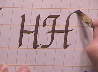
I’ve completely redone the upper case (majuscule) lettering videos to include the swash variation on the same video as the lower-case (minuscule) version. The videos have already been edited. If you like the treatment I did with the lower-case standard-plus-swash version videos, you will like these!

Standard and swash versions side by side in the same video

Standard and swash versions side by side in the same video

I added a new article, Italic Variations, to the book chapter section. There, you’ll see examples of more ways you can stylize your letters to fit your work to your theme. I have a few more pictures to make before it is complete.

This V4 will probably be the last update. After this I will start on a new app featuring a different calligraphy alphabet style — again, complete with videos!

I changed the name of this blog to better reflect its purpose.

Get V3 in the iTunes Store now http://itunes.com/apps/steveusting and start learning Italic calligraphy today!

Watch the video for V3.


Posted in iPhone app | Tagged | Leave a comment

V3 of the calligraphy app has just been released!

Apple announced that the Learn Italic Calligraphy app is “Ready for Sale!” So see what’s new and get a look at a new video uploaded.

Posted in iPhone app | Tagged , | Leave a comment

New changes to the January 2012 version of Learn Italic Calligraphy iPhone app

My iPhone app, Learn Italic Calligraphy V3, still aimed at beginners, will have a few exciting additions!

Watch the video of V3!

1. Several lowercase videos have been completely re-shot to show their simple and swash styles side by side.

2. I reshot the “number” videos to show two versions of digits 0-3 and 5-9.

3. I added a new chapter to the book on how to center lines of text. You’ve seen those poems in calligraphy where all the lines of text are perfectly centered. How do they do that? Full-color photos show each step.

4. I added a large number of amazing video links to the app.

5. I expanded on several chapters in the book, adding a few more tips and information beginners should know about their equipment.

I am hard at work on the next version already. I’ve already reshot the capital letters to show their plain and swash versions side by side. All those videos need to be edited to replace the current videos. That’ll be in the February update to the app. I’ll include one-two more chapters in that version as well.

Then it’s on to create more calligraphic apps of different alphabet styles, with all videos in-app!

Posted in iPhone app | Tagged , , , , | 2 Comments

2011 Christmas Card Design Process

I thought I would describe the design process for my 2011 calligraphy Christmas card.

After several false starts, I decided on a circular design, with “Merry” repeated around “Christmas,” flourished inside and out. I was determined to keep it simple with a minimum of retouching. I would do the text by hand and add all the color in Photoshop. I chose the Italic Chancery hand for the “Christ” portion for its simplicity, and the “Merry’s” elongated style, which I haven’t done before, for contrast and fun.

Finished calligraphy Christmas card by Steve Husting, Dec. 2011

Finished calligraphy Christmas card by Steve Husting, Dec. 2011

Continue reading

Posted in design | Leave a comment