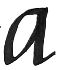
To my recent first-time calligraphy students: Many of you in then first class had trouble making the lowercase letter a, and for that I apologize. On this page I hope to clarify the different kinds of issues I found, and ways to correct it. I’m hoping this training approach helps you better understand what goes on in the making of the letter, and helps you self-correct.
Some of us drew strokes that were uneven because the whole width of the tip was not touching the paper. Practice tracing these lines using this PDF with your tip constantly at 45 degrees. Print this out so you can follow this web page. You will get the thin stroke going off the vertical lines at top and bottom only if your pen remains at 45 degrees.
The 3mm felt-tip pen angle needs to be 45 degrees throughout the making of the letter. This means we keep the wrist in place and not bend it. This means that we’ll move the whole hand to make each stroke. Here’s what the left side of the first stroke looks like if we don’t bend the wrist. The beginning and the end of the letter is at 45 degrees, with only a slight arc. The thick part of the slight arc is in line with the dashed slant line. The small lines at the beginning and end of the stroke are both 45 degrees.
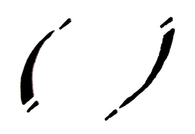
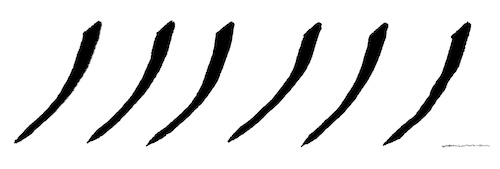
Then the second part of the stroke, a starts off thin at bottom and ends thick at top. It is a slightly wider arc because you are connecting the previous line at the baseline and aiming at the waistline at a distance to form the width of the a. The small lines at the beginning and end of the stroke are both 45 degrees.
Here’s what happens when we bend the wrist as we make the stroke. (This is not advised.) The stroke begins at 45 degrees, but the end is at a much steeper angle, as seen by the small lines at top and bottom.
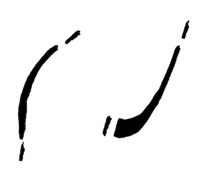
If you continue the 2nd half of the stroke at that angle (the right side of the V shape of the a), it will be a thick line at the bottom and not look right. You will wonder why it’s not thin. That’s because the tip is not 45 degrees, but steeper.
Why would we bend the wrist? Because that’s the way we write small letters with a normal monoline pen on paper. We move our wrist and even our fingers to shape the letters.

This approach doesn’t work with a flat, chisel-edge tip that is 3mm wide. This means no finger movement or wrist bending will work. However, you can do finger movement and wrist bending if you use the 1.5mm tip on the other end of the pen. Just control the pen so the 45-degree angle remains as constant as possible.
I want to suggest another way to think of drawing Italic calligraphy letters. Perhaps we tend to subconsciously shape them so they are a little more like our normal English alphabet letters. So they may be too rounded at times. To prevent this from happening, I want you to look at the strokes as Egyptian hieroglyphs. So the V-like stroke of the beginning of the a is a different language. You are not trying to make it like an English printed a.
Carefully, slowly practice the strokes below as shown, using this PDF, keeping the strokes at 45 degrees from top to bottom. Trace over the gray letters so you get the feel of making them. At right, make the letters on your own. At no time are you making a straight line.
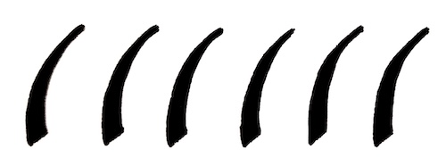
Again, practice the strokes below as shown, keeping them at 45 degrees from top to bottom. Trace over the gray letters so you get the feel of making them. At right, make the letters on your own. The line is always curving–no straight lines.
Now make the two strokes connect as one continuous stroke. You will reach the baseline and very slightly round the bottom point before pushing up to the waist line.
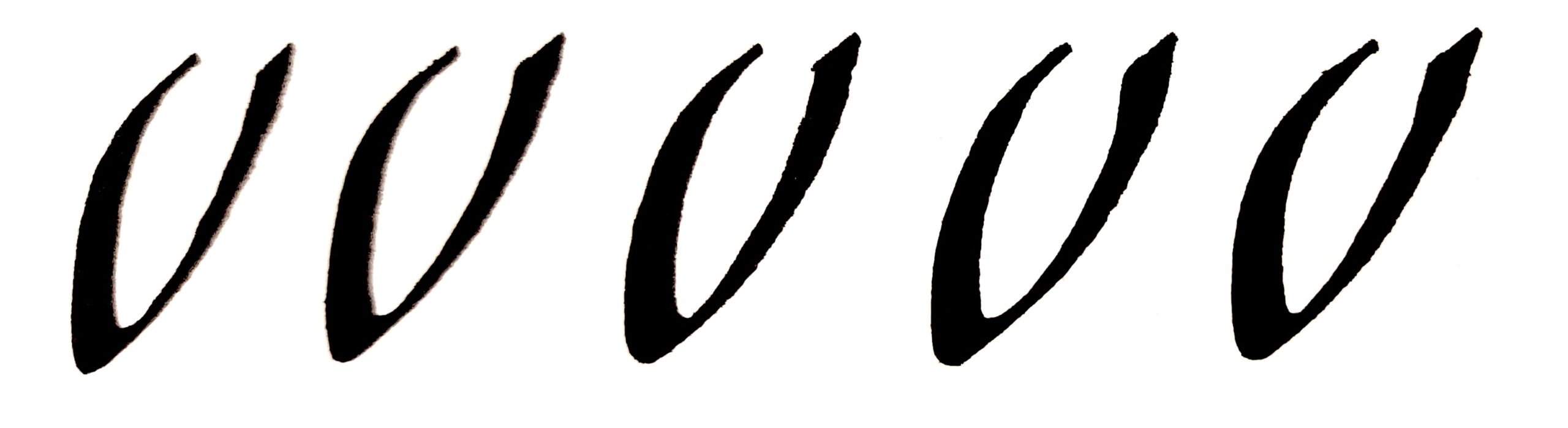
Go ahead and finish with the top and right side strokes.