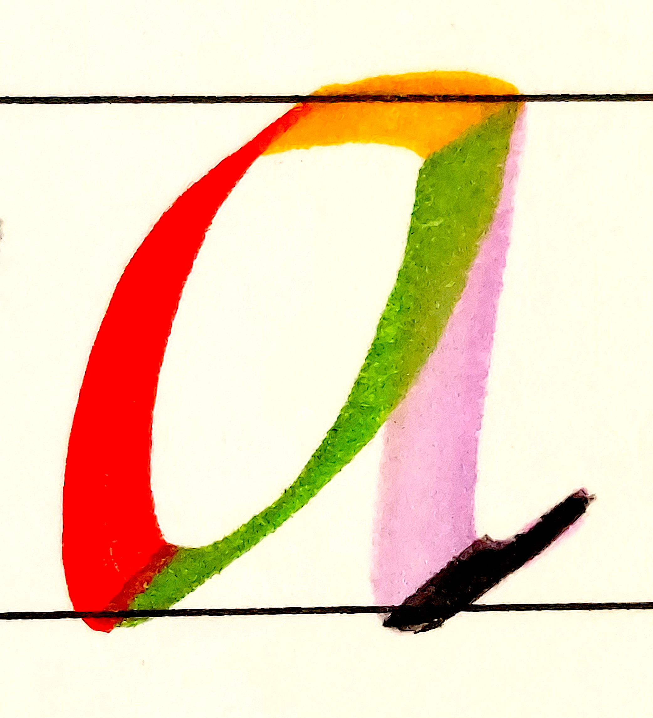
The left mark of the a is the beginning of the letter’s downward journey. It starts from above as a point and travels down, as the Son of God left His throne in heaven to come to earth below. The beginning is a sharp point. At the beginning, the Lord had the thorns and nails in view, being crucified before the creation of the world.
He humbled Himself and came to earth. The line thickens as the Son takes on shape and we see the Father and Son more clearly, incarnated, full of grace and truth.
He dies on the cross and is buried, the burial seen as the mark dips below the baseline “ground.”
Then the second mark begins its ascent as the Son is resurrected from the dead. The mark ends with the ascension of the Christ into the throne room. These two marks are like the two testaments. The first looking forward to Christ and the second looking back to Christ. The joining of the two marks is the crucifixion, death and burial of Messiah, the reason Christ came.
Some of my first-time students miss this “point” and round the bottom of the “a” like the English lowercase a. Similarly, many miss the spiritual depths of the death, burial and resurrection of Christ, which is revealed in Romans 6 and related passages. They miss identification with Christ. The reason the first mark goes down and the second goes up is because they are formed by a single stroke with a slight round at the bottom. A stroke ends with the lift of the pen. The marks belong together as one stroke. They have their fullest meaning when kept together.
Once the Christ reached heaven above, we see the next mark formed. Jesus is given the name above all names. He rules over all. So the mark is stretched above all. Breaking through the waistline “ceiling” means He has been given the name above every other name.
And when He reached the throne, He sent the Spirit down to abide in His believers as the vertical stem shows. Those who identify with Christ’s death, as does this mark when it dips below the baseline, get a taste of resurrection life with with the upswing of the final mark.
The last mark is called the exit stroke. There, we exit viewing the physical world as we used to and see with new eyes, the eyes of faith seeing the kingdom of God, seeing according to God’s vantage point as taught in the Word. Our minds are fixed on Him above, not on the earth.
That same final downward vertical stroke can also be the future return of Jesus Christ to set up His kingdom, with the exit mark being the resurrection bodies of the dead.
Inside the hollow bowl of the “a” are often three distinct points, depending on the variation of Italic used. They signify the Father, Son, and Holy Spirit. God was in Christ. The fullness of the Godhead dwelt in Him bodily. We may even say that the space is enclosed by the “a,” even as Christ was enclosed in the womb of Mary.
To the bottom right is a triangle of space formed by the up stroke and the vertical stem. In that area is more than enough space for all believers to come and abide in the shadow of the Almighty, to dwell in the secret place, in the cleft of the rock. Its access is from below, in the lowliness of humility, and there He teaches the humble and guides in His ways.
The thick vertical stroke is called the stem. We who abide in the Almighty, clinging to Him, are the branches off the stem and bear fruit in Him. Also, this stem defines the slant angle of the letter, like 5 degrees. Leaning at an angle, the saints may lean on Him and find their rest in Him.
The stem is made with a broad pen nib. But being at a 45-degree angle, we don’t see the full width of line the pen is capable of. And yet there is a point where the full width is seen–where the left mark dips below the baseline and starts the upswing. That’s a point a calligrapher can use to discover what pen width was used for an unfamiliar alphabet style. That dip in the stroke is the place where our Lord was glorified in His humility at the cross.