Trying out lessons from “Scribe”

On pages 88-89 of Scribe by John Stevens, John gave several kinds of exercises that he gives to his students. I thought I would try them out with the Copperplate practice I was doing at the time.

In the first line, I did plain Copperplate.
In the second line, I changed the angle of the letters.
In the third line, I added bounce to angle change, moving letters up and down.
In the fourth and fifth lines, I added stretch to some of the letters.
Finally, I changed the baseline. As you can see, it had evolved to a modern calligraphy look with very little effort.

As you do each step, he stresses that you are supposed to ADD to the previous steps, and that can be hard to keep in mind. Of course, you can add other variations, such as color and overlapping.

The final result is still a bit wonky, but it’s a good exercise to stretch oneself! We could do this with any writing style or tool.

Exercises from John Stevens' book, Scribe.

Exercises from John Stevens’ book, Scribe.

Posted in design | Tagged , , , , , | Leave a comment

Memorial Day piece: In Flanders Field

In Flanders Fields, Memorial Day, Veteran's Day, Remember our soldiers

After I saw several small calligraphy pieces in a Boston bookstore, I was challenged to do my own “small” piece using a Brause 1mm nib. The result is this famous poem rendition in Uncial.

Each letter is only 1/8″ high, not including the ascenders or descenders. It is only four inches from the top line of text to the bottom of the last line of text.

Posted in design | Leave a comment

Tiny illuminated manuscripts found in Boston bookstore

I recently returned from a vacation in Boston and came upon the Commonwealth Bookstore not far off the Freedom Trail there. Lo and behold, they had several pages of illuminated texts framed for sale from $850+. What was so interesting, though, was their size. They had a lot of detail and yet the pages were barely 5″ tall!

illuminated ms in Boston bookstoree

illuminated ms in Boston bookstoree

I received permission to shoot them and share. I uploaded the pictures here: https://www.flickr.com/photos/95697769@N07/sets/72157651448155119/show

Posted in Uncategorized | Leave a comment

Updates to Fantastic Calligraphy Links

Above, you’ll see Fantastic Calligraphy Links. I made several large edits to that section.

I inserted my final entries to Western Calligraphy in the Movies that I had not gotten around to adding earlier. Many thanks to those who suggested titles and gave links. Time to add some of these videos to your Netflix queue!

I updated Calligraphy Internet Resources. I added more links to the various U.S. calligraphy guilds and sought to add as many as I could in each state. This list is now alphabetized according to postal abbreviation. This list is not complete; some states have more than one guild, but I haven’t been able to find a link to their individual sites. If you’ve been wondering if a guild is in your state, check this page and see. If the guild listed in your state is too far, then contact them and ask if there are other guilds elsewhere in the state.

I’ve also added several more categories of resources to the page with their own headings. Check out the page and see if there are any of interest to you. I inserted links to the headings at the top of the page so you can jump right to them

My Book Collection page has been enlarged slightly, and I added RECOMMENDED to certain outstanding books.

If you have information that belongs on these above pages, please type it into the box at the bottom of that page to share it!

Posted in Uncategorized | Leave a comment

Letters CA Style 2015

I and many other calligraphers spent four days this past weekend in Pomona, California at the annual Letters CA Style calligraphy workshop retreat. To get an idea of the many classes and the talent that was on hand, take a look at my Flickr account and browse through the pictures and videos.

https://www.flickr.com/photos/95697769@N07/sets/72157650504903559/

You’ll see pictures from the class I took with Ed Fong, and pictures from almost all the classes as I went through them in the class walk-through time on Sunday afternoon. Several pictures are for raffling off, others were displayed in a gallery for voting and member appreciation.

Have fun, and may inspiration strike!

Posted in Resources | Leave a comment

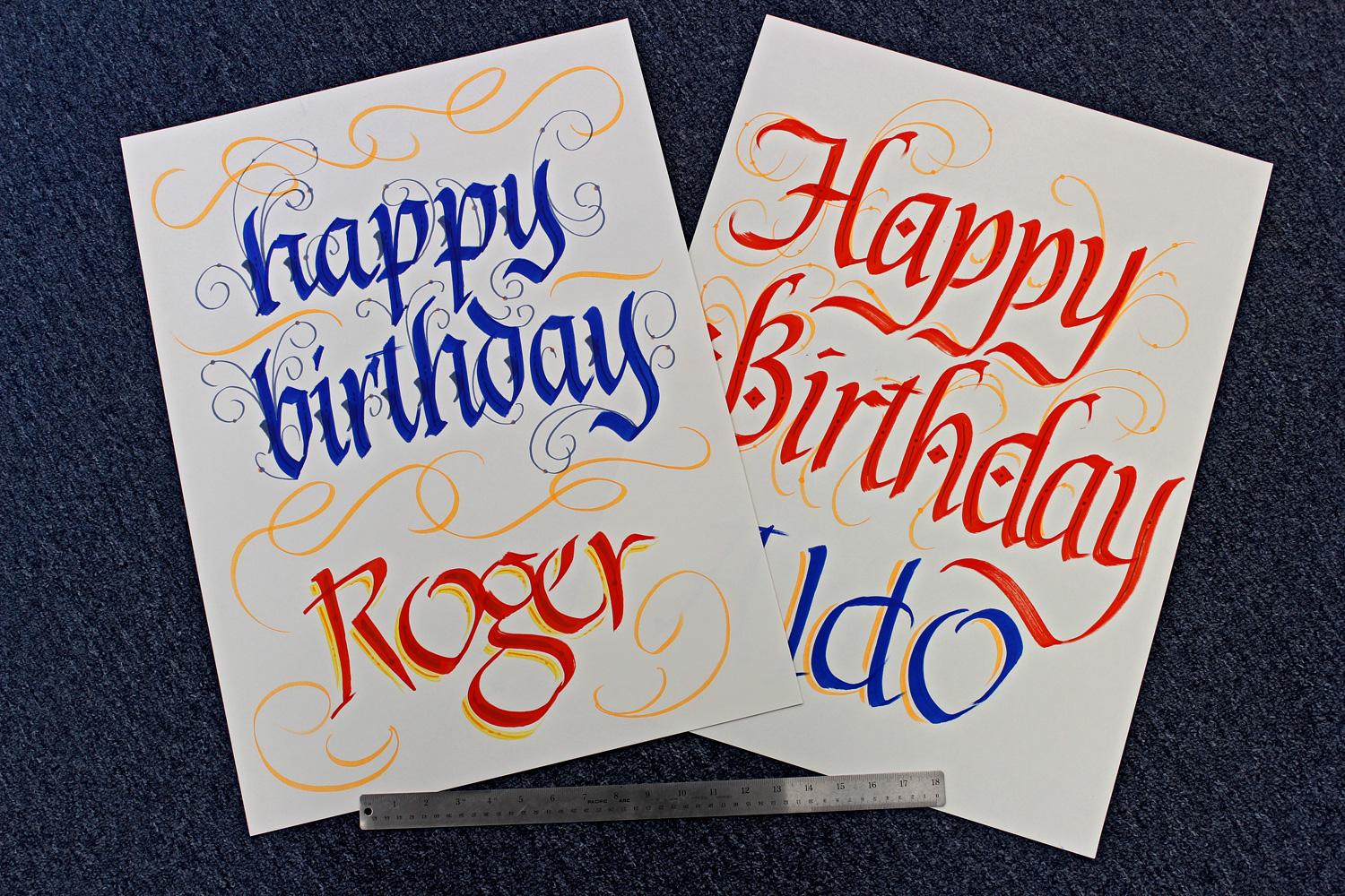
Birthday Cards for Work

Birthday cards for work

Birthday cards for work

For about a year now I’ve been doing the monthly birthday cards for the company’s employees. In the past, the company bought giant Hallmark cards, large enough for every employee to sign, and they were given out once a month at a get-together in the company lunchroom/meeting hall.

My sister, who also works there as the bookkeeper, saw my calligraphy and suggested they ditch the cards and have me make them instead. So I bought a pad of 18 x 24″ paper and used normal markers to make the cards. Then at Aaron Art Mart I purchased two oversized, 15mm Acrylic paint markers, red and blue, and tried them out. The letters look much better with them. The above will go to the two birthday boys for this month, rolled up with a fancy ribbon placed around each, their names and year lettered on the outside edge in Uncial. At 18 x 24″, it provides plenty of space for everyone to sign.

Posted in design | Leave a comment

Joy to the World artwork, attempt #2 (with video)

I finished my second version of Joy to the World. The problem with the first version is that although the word joy was there, the “joy” wasn’t. So this version was an attempt to put the joy into the work. It accomplishes that better than the first attempt.

I used brush and folded pen to do the preliminaries sketches for the “Joy.” You’ll see them all in the video I made of the process. As you’ll see in the video, I painted the letters below “joy” by tracing the letters with a light pad. Then Joy itself was outlined with colored pencils, warm tones on the left edges of the letters and cool tones on the right. The paper color was allowed to show through the letters themselves. The video doesn’t show it, but after all the painting was thoroughly dry, I heavily retouched the letters with colored pencil to form the letters nicely where the painting was uneven. I used gold gouache to fill in some of the counters. Continue reading

Posted in design | Leave a comment

Western Calligraphy in the Movies

This is a fun list of western calligraphy being used in public theatrical films and TV shows. The calligraphy in this list may have appeared in titles, credits, used by characters in the film, or included calligraphic elements on objects. There are two sections to this list, Calligraphy in Movies and TV, and Calligraphy in Titles and Credits Continue reading

Posted in Resources | Leave a comment

Not quite right

Joy to the World - preliminary

Joy to the World – preliminary

I created this piece recently, but it’s not turning out the way I wanted. I thought I would put it up here, because it’s still nice to see!

Joy to the World - preliminary

Joy to the World – preliminary

Posted in design | 1 Comment

Hark! The Herald Angels Sing

After many preliminary sketches to decide which way to take this work, I finally finished Hark! today.

Calligraphy by Steve Husting, finished 12/27/2014

Calligraphy by Steve Husting, finished 12/27/2014

Continue reading

Posted in design | 2 Comments